
What is a responsive website?
We will provide comments on responsive website design.

What is a responsive website?
How many devices do you use to browse the internet on a typical day? We would hazard a guess that this number is two or more (with mobile phones, laptops and tablets featured on most people’s lists). Yet, the chances are that you expect to enjoy a seamless browsing experience, no matter your choice of device(s). This certainly holds true for mobiles. Google’s Consumer Insights finds that “53% of [website] visits are abandoned if a mobile site takes longer than 3 seconds to load”.
The importance of such a seamless experience is backed up by industry professionals. As many as 73.1% of web designers believe that “Non-responsive design is a top reason why visitors will leave a website”. But what makes a website responsive? And why is responsiveness such a key element within the overall user experience?
Why you should opt for responsive website design
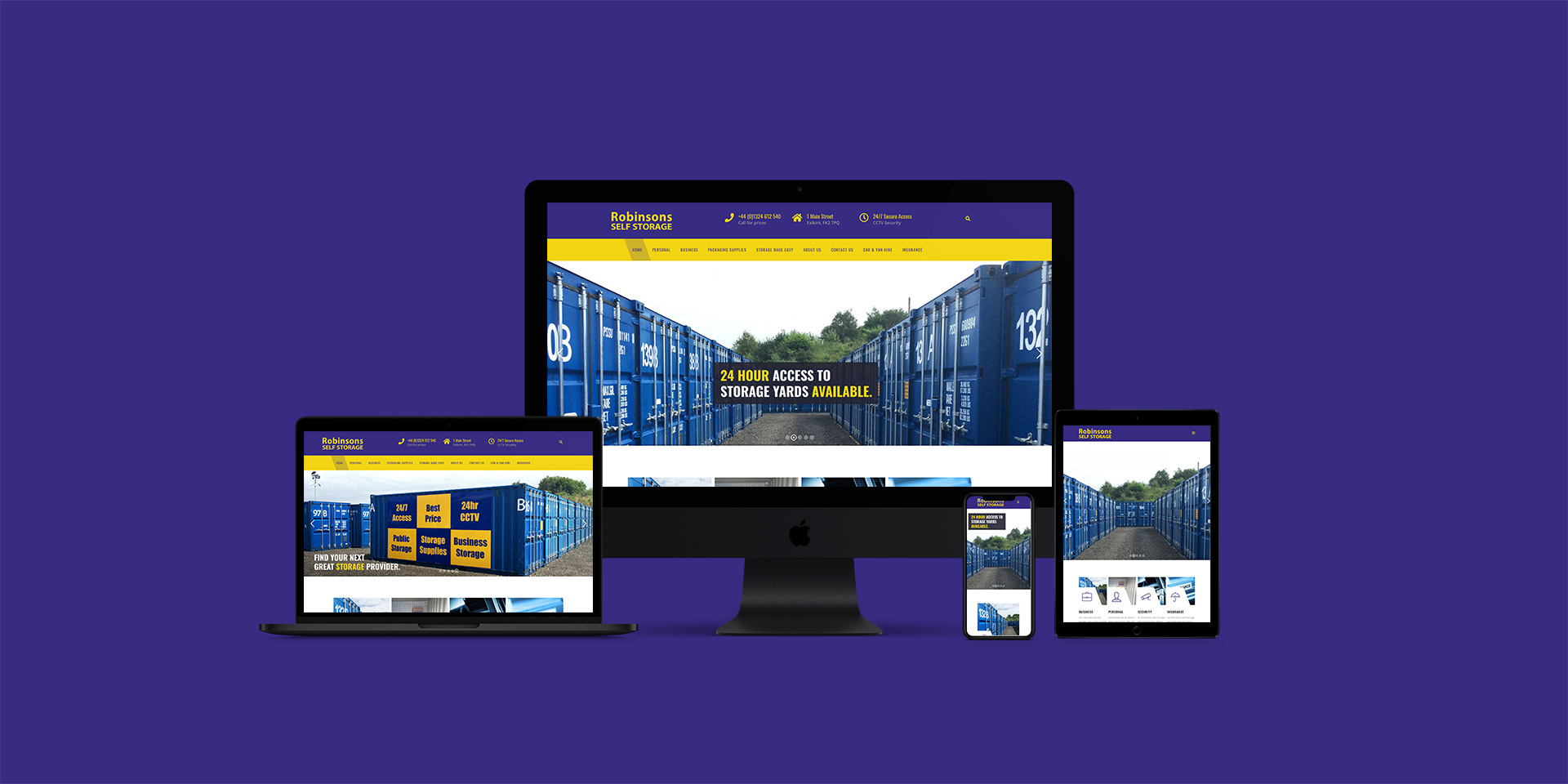
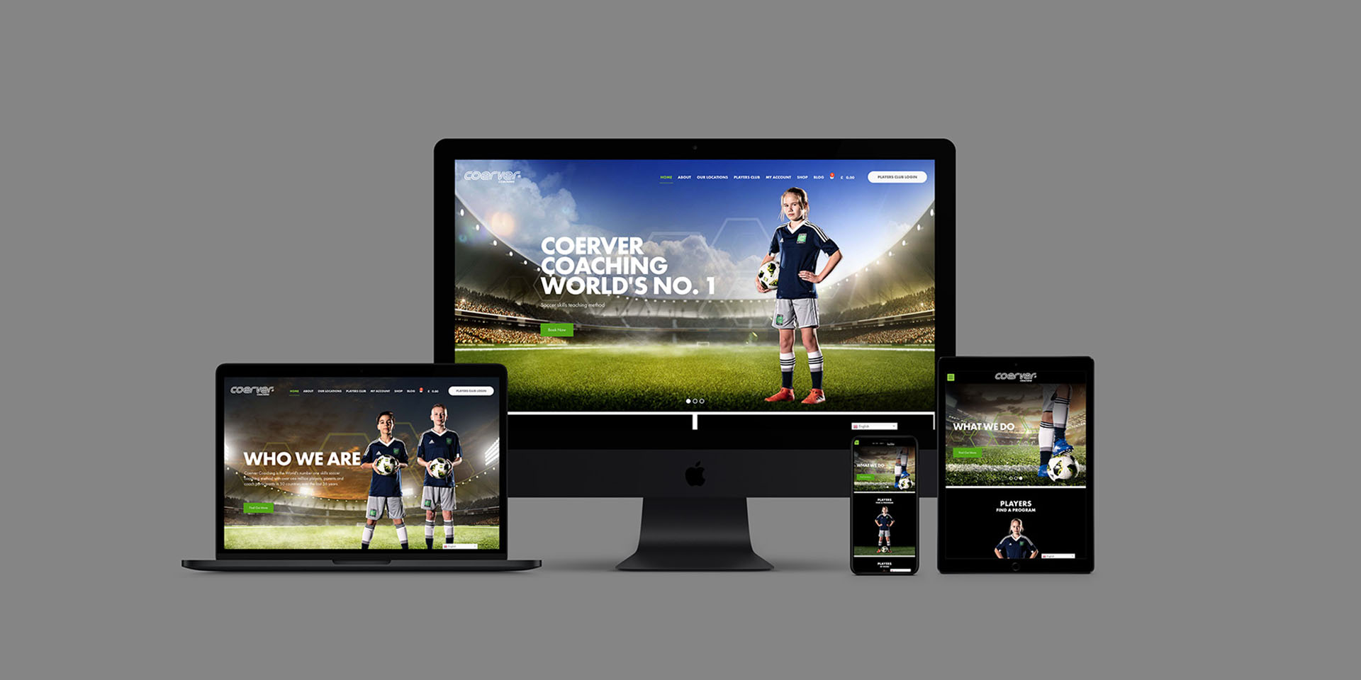
A responsive website will be displayed as clearly on the latest smartphone as it is on a traditional desktop computer. The text will be easy to read and the layout will be uncluttered. This adaptiveness can be achieved through the process of responsive website design (RWD), allowing for dynamic changes depending on the device type, screen size, and viewing mode (whether in portrait or landscape) of the particular user.
RWD involves the use of flexible grids, layouts, images and CSS media queries. Such websites have the flexibility to adjust to different screen resolutions, image sizes and scripting abilities. There’s no need to go through the process of web design and development for each device, provided that these responsive elements are included from the outset. We can support this need, saving you time, inconvenience and disappointment.
Responsive website design requirements
If a website has been designed responsively then the server will continue to send the HTML code to all devices. Here, CSS is used to ensure that the website is rendered correctly. Google’s algorithms should automatically detect such responsiveness if its search spiders are able to crawl the page. This includes elements such as CSS, JavaScript and images.
You’re likely to enjoy the following benefits as a result of RWD:
- Engagement of a wider audience
- Ease of maintenance (you only have to look after one website version)
- Consistency across multiple devices (improving the user experience)
- Reduced bounce rates and improved conversions.
Google recommends RWD as the first choice of design. It ties in with their prioritisation of mobile-first indexing, with mobile websites being crawled and indexed ahead of desktop versions. This makes it even more important to ensure a smooth and pleasurable experience for mobile users. The reward can include improved SEO and higher search result rankings.
Responsively designed websites will also load more quickly on mobile devices than they do on computers. And quick loading times are taken into account by Google. This can mean more traffic and potentially more sales. As a recent Google study showed, a decrease in mobile load times by just one-tenth of a second can boost conversion rates by 8.4% for retail sites and 10.1% for travel sites.

Testing your website’s responsiveness
You’re probably wondering just how quickly your own website will load. In this case, you should head across to Google’s page speed test page to enter your home page URL. Click on the “Analyze” button to see how your site’s speed index (loading time).
Website responsiveness can be further improved in the following ways:
- Setting appropriate responsive breakpoints
- Using a fluid grid
- Allowing for touchscreens
- Setting CSS rules specific to the display of images on different devices
- Using pre-designed themes or layouts.
Testing should always be carried out to discover the effectiveness of such website changes. This will mean viewing your website on a variety of devices to ensure the best possible user experience. There should also be some allowance for website performance in places with different levels of connectivity, given that people might access your website via Wi-Fi.
Call in award-winning professionals
As noted on thefingerprint web design services page, we have the expertise to optimise your website for usability across a full range of digital devices. You can count on us for the development of web pages that work just as well on smartphones as desktops or laptops.
We’re here to help! Simply contact us, send an email to design@thefingerprint.co.uk or call +44 (0)7740 348 521 for a no-obligation discussion.
If you are enjoying this article please read our blogs Why use WordPress? – thefingerprint, What is SEO and where to begin? or thefingerprint wins Design Agency of the Year for a third year!.