Colour – why calibrating your monitor is important
We will provide guidance on why colour and calibration is important.

Why calibrating your monitor is important!
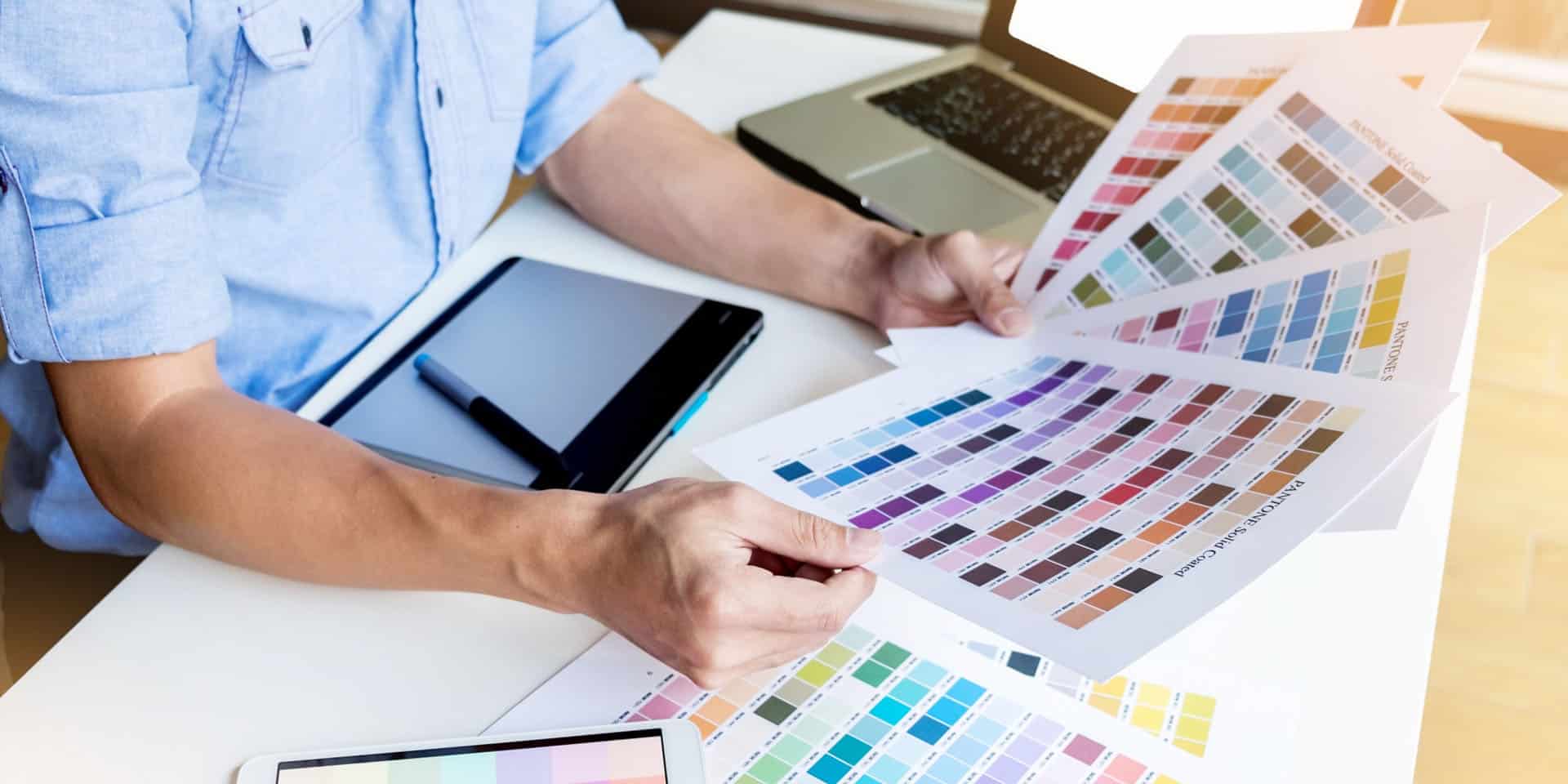
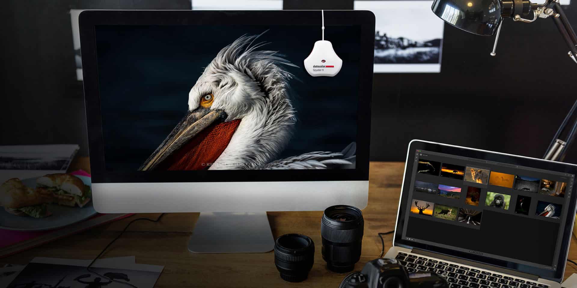
Have you ever noticed that your PC or Mac monitor can vary in colour from a colleague or family member’s screen? You may dismiss it, asking ‘does it really matter?’ or believe it is something you can live with. But, when working with a designer, photographer or other visual creative, this colour difference can be more than inconvenient.
If left unchecked, it can lead to:
- Misunderstandings
- Wasted resources
- Running over budget
- Delays
- Utter disappointment.
Maybe you are already painfully aware of this mismatch. Ever ordered your holiday photos from an online printing company, only to see discolouration or dullness that was not there on your device? This disappointing result could be your computer monitor’s colour settings – leading to misguided editing.
Sharing the secret of perfectly matched visual assets, this blog will explain why calibrating your monitor is a good habit to adopt.
But first, the techy bit!
Knowing what you should do is only half of the story. You need practical advice you can use to fine-tune your monitor’s colour settings. But before you are tempted to throw your screen out of the nearest window, know we have the answer. It involves three key factors:
- Gamma
- Brightness
- Contrast
If this suggestion has filled you with anxiety, or you don’t know your gamma from your contrast, there is no need to despair. You’ll find the straightforward guide ‘How to calibrate your monitor’ a great place to start.
Let’s continue by discovering three core reasons why you should calibrate your monitor if you are working with a professional creative or client.

To meet everyone’s expectations
We cannot forget to recommend that both parties calibrate their screen. From a design point of view, we strive to exceed our clients’ expectations. Calibrating your monitor helps us to achieve this by ensuring everyone’s monitor settings are aligned. It means that the client and designer are visually ‘on the same page’, avoiding repeated edits regarding incorrect colours before the design can be printed or published online.
The remote nature of modern work means calibrating both parties’ monitors has become even more necessary. Due to geographical reasons, the client may never meet their creative partner – or view the end-product shown on the same screen(s) as it was designed/edited.
Taking this measure also helps you to create the project ‘on brief’. We can appreciate that two blues evoke completely different moods in the viewer’s mind. Screens with a yellow cast would distort the designer and client’s perception of the design. Consider, for example, an airline that wants to evoke a clean blue sky. Designing a logo on a monitor with a tint would give a completely different association – possibly causing consumers to imagine a turquoise sea.
The image or branding would then be at odds with the business’ message to choose air travel as their mode of transport. Yet, if both the client and designer/photographer’s monitors are calibrated correctly, such mistakes can be avoided before being published online or posted on social media. Potentially costly mistakes can be spotted and amended before the printing costs are paid.
Consistency is key
We believe in giving the client what they expect each time they work with us. After all, they could adopt their new logo, branding and photography in their marketing and printed materials for years to come.
This consistency becomes even more necessary when you work with a client, or are the client, on a repeat basis. You need the colours in your designs or images to be spot on from the very first project of the working relationship to the second, third and fourth occasion. Calibrating your monitor is therefore important whenever you buy a new computer or individual monitor, as either a client or creative professional.
Having a studio of calibrated monitors also allows team members to work at different computer stations. They can share ideas and present to the client on any calibrated monitor, confident that what they show will be replicated on any other calibrated screen. They will appear more professional and demonstrate their expertise.
Reputation management – for all
Reputable designers, photographers and visual creatives their calibrated monitors to speak the same visual ‘language’ – in terms of colours’ brightness, gamma and contrast – as their clients’ monitors. Clients can see what you see on their screen and will have little room to criticise live or printed work. Leave it to chance, and the client could give negative feedback. You do not want this leading to a less than golden reputation and loss of business from them and other clients.
However, the client will also ‘lose face’ with their customers when they use incorrectly coloured graphics on their website or distribute mismatched business cards, posters and other printed products. Selecting a brand’s distinctive shade becomes part of its identity, often involving many weeks or months of agonising over what impression it gives to potential customers.
Imagine any of the following three brands using the wrong shade of:
- Red for Royal Mail
- Green for Starbucks
- Yellow for McDonald’s.
Caused by an uncalibrated monitor, even a slight difference is sure to dilute the brand’s authority, identity and online following. Can you afford not to double-check your monitor has been calibrated?

How regularly should I calibrate my monitor?
Understandably, the term ‘calibrating your monitor’ may have filled you with fear at the beginning of this article. Even the savviest computer users may be surprised to learn they need to do this, asking “aren’t all monitors made to universal standards?”. However, it is frustrating to learn that even the same brand’s colour settings can differ across their range of monitors and computers.
Finally, monitors should be recalibrated after each 200-300 hours of use. Their brightness and white colour temperature shift gradually as you use your computer. So making time for this essential maintenance is a wise move you, your budget and professional standing will not regret.
In conclusion
We hope these reasons have encouraged you to calibrate your monitor. We’ve calibrated ours and are fully prepared to deliver outstanding branding, web development and graphic design that will match your expectations. Discover more about our services by contacting us where we would be happy to discuss how our award-winning web design and development services can help you. Simply call +44 (0)7740 348 521, or contact us for more advice.
If you are enjoying this article please read our blog Designing for Print – Does it Still Make Sense?, Colour – Why Making the Right Choice Matters, Why writing a blog is important for business and SEO all of which are important to reaching clients and increasing sales/business opportunities.


