Type & click enter
Portfolio
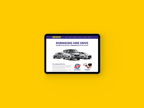
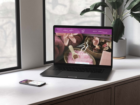
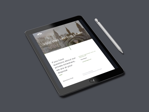
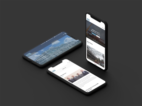
Latest projects


This is a unique website which will require a more modern browser to work!
Please upgrade today!